The Value of Entering Art Challenges
The issue about any type of creative pursuit is that we tend to want to stick to our favorite designs and use our favorite colors. I’m fighting with myself over the color issue now. If I’m not careful, all of my fabric designs would either end up being blue - purple - green or vivid brights. And if I’m honest most of the designs in my Spoonflower shop fit into these two basic palette types.
So when the Warm Minimalism challenge came up, I decided I’d better push myself outside of my comfort zone. The design was supposed to be for wallpaper.
I had to start by looking up exactly what minimalism is.
“Minimalism is an extreme form of abstract art developed in the USA in the 1960s and typified by artworks composed of simple geometric shapes based on the square and the rectangle.”
Then there was the color palette: warm neutrals. Definitely not my usual colors.
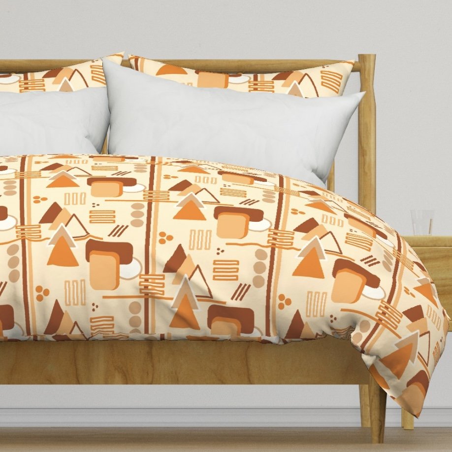
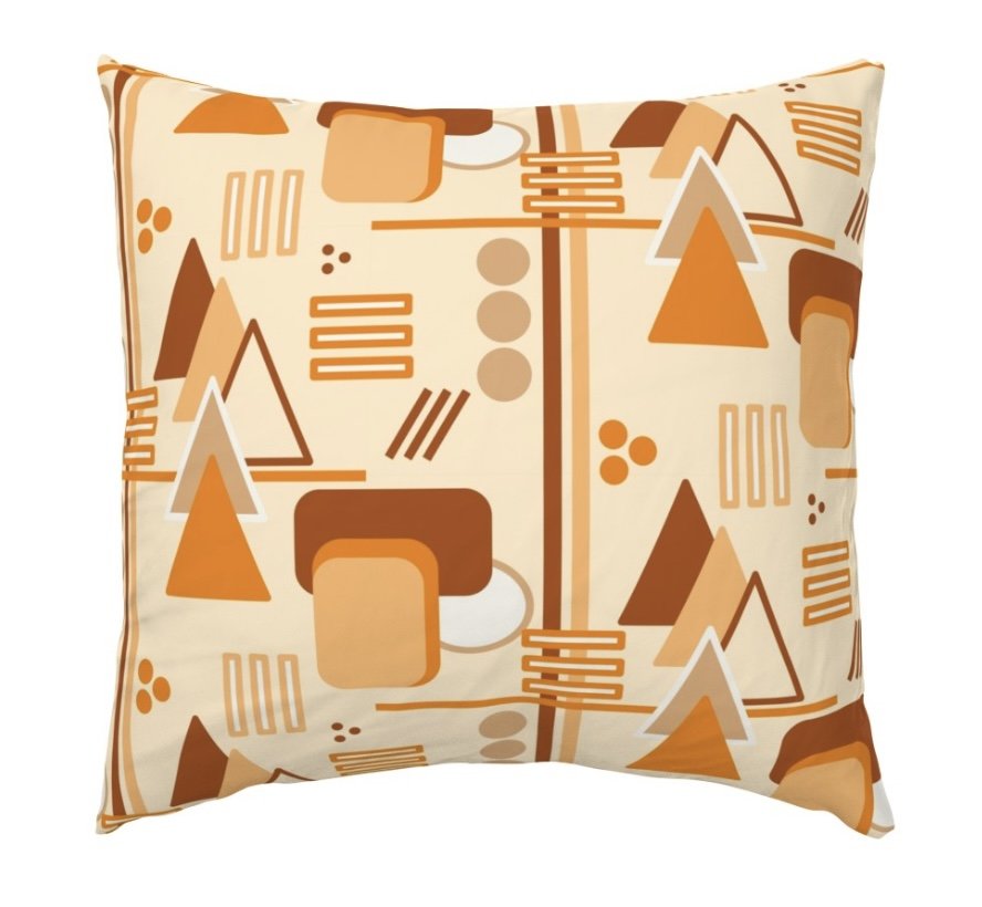
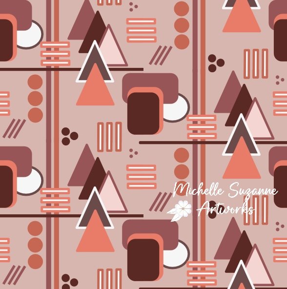
Here’s what I came up with:
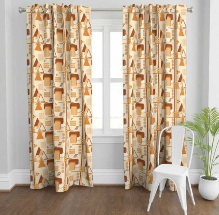
In hindsight, I still think this design is too busy to qualify as minimalism. I probably won’t do well in the challenge scoring. And while it would be nice to do well, that isn’t the reason I enter the challenges. In the end, I have a design I like using colors that are foreign to my creative process. And it looks nice in home decor as well.
Okay, I admit there is a distinctly 70’s vibe going on here.
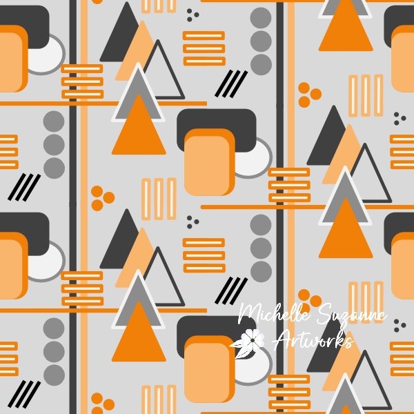
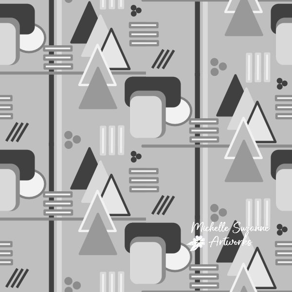
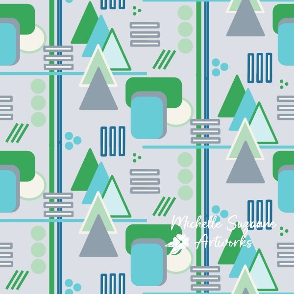
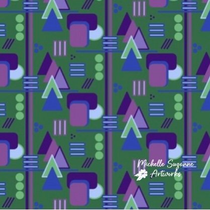
Next, I had to experiment with other palettes. The top four palettes would have never existed had I not been pushed. But I have of course included one with my favorite colors too.
I’m still uploading these designs (in two sizes as well). I predict that I will add to them as the mood strikes to add new palettes. If you are interested, watch this space. Geometric Abstracts
And if you like to vote on the best designs, you can vote here. Voting closes March 12, 2024. You can vote for as many designs as you like. Don’t feel obligated to vote for mine. I’ll readily admit there are many beautiful designs that you may prefer. And all the artists will appreciate your vote.


